Firefox on the Mac is, well, it doesn’t always fit in quite as well with the Mac as it could – and it feels like that’s always been the case.
Firefox 3 is meant to start changing that, and making Firefox feel like a first class citizen on OS X. Having heard Jacob’s singing praise for the beta’s integration with GTK on Linux, I thought I’d download the Mac build and give it a try.
The first thing you’ll probably notice is real native buttons. Instead of Windows 95-style boxy buttons, native Mac buttons are now used, unless the website specifies specific button colours, in which case those colours and styles are used on the standard boxy buttons (exactly the same as Safari 3 now does).
There’s also a new theme available, called Proto. It doesn’t ship with the beta, but is linked to from the welcome page you get. And this is what it looks like:
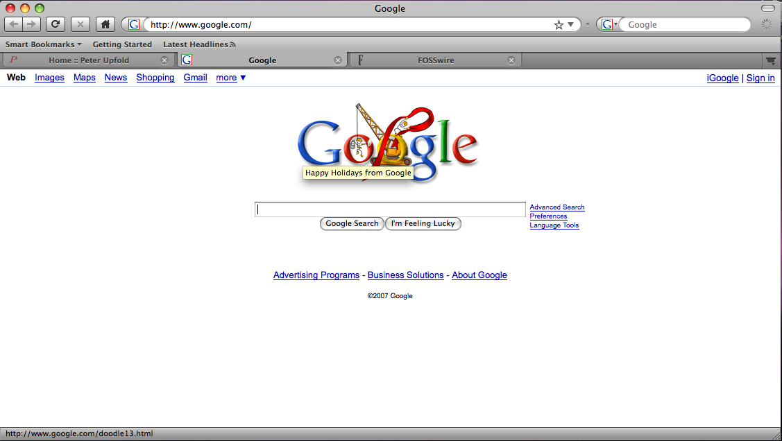
I like it. It’s not perfect yet, and it’s not finished either, but it brings a much more Leopardy, Mac-like feel to Firefox. With some refinement, I’m pretty sure that Proto could make a fine default theme for Firefox 3 on the Mac (just give it bookmarks icons, please 😀 ).
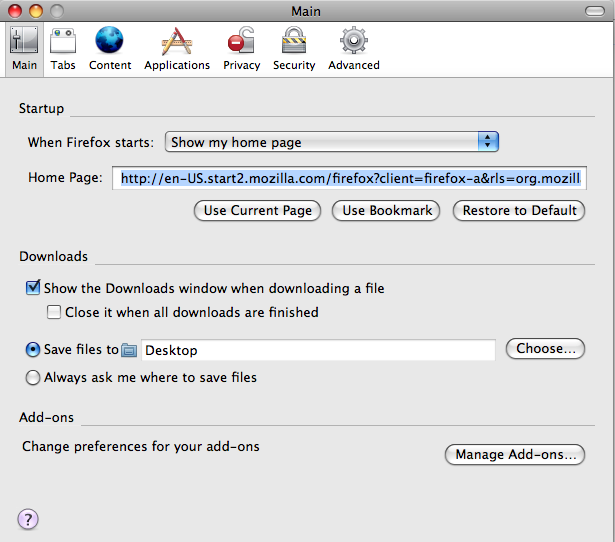
With the Proto theme activated, it also Leopard-ises other Firefox windows. Take the Preferences window for example (the same as Options for those of you who have only ever used FF on Windows).
Without Proto:
With Proto:
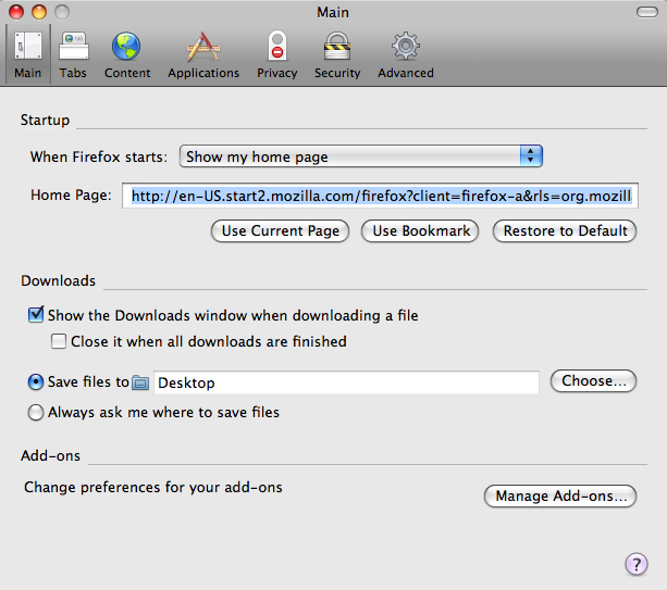
It’s still not perfect, but with Proto enabled, it feels much more Leoaprd-like and fits in better with every other app out there.
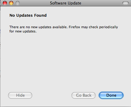
As I said though, there are still some issues. In dialogues without a toolbar, the title bar’s gradient can look a bit wrong, as seen here in Software Update (first without, then with Proto):
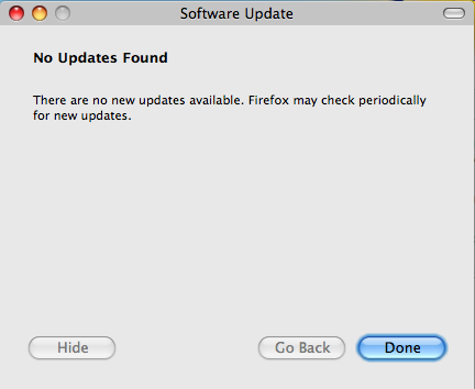
But it is all good progress. Firefox 3 Beta 2 is a definite thumbs up from me on OS X. Looking forward to the final release!
If I don’t speak to you before, here’s wishing all my readers a great Christmas. 🙂
Yes, I know it’s been far too long since my last post. I’m sorry.