Just yesterday, the 14th major release of the Ubuntu operating system was released into the world. One of the biggest new things in the Natty Narwhal release is the new Unity interface — which will be the default interface for the OS. I wanted to take a moment to record my initial thoughts on this new interface direction. This is not, then, a particularly in-depth or scientific analysis, but just a few thoughts on the new interface design that I wanted to share.
Compatibility
The new interface does require 3D acceleration, it seems, and both my standard VMware Fusion testing method and a five-year-old PC with an ATI graphics card didn’t seem to have much luck running Unity right off the bat. While I’m sure both could be coerced into it, I had much more success running from the live CD on my 2006 MacBook (perhaps, in part, due to the availability of open source graphics drivers for its Intel chipset).
So, while it was a mixed bag for compatibility on my systems, even in those cases where I had no luck, the ‘classic’ interface continued to work just fine.
The Desktop
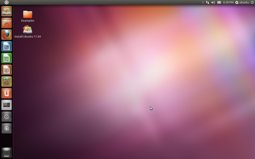
On the face of it, there are two major changes. First of all, the familiar Applications / Places / System menus have been replaced with a single Ubuntu logo button, and the panel at the bottom has also been replaced with this left-aligned ‘Launcher’.
It’s a nice setup, with the Launcher behaving in a way that will probably be familiar to both Windows 7 and Mac users. Is it particularly innovative? Perhaps not. But its use of the 3D accelerated hardware does add smoothness to launching apps (with a pulsing colour effect to show the app is launching) that is attractive, without being overbearing. It’s a good start, even if the move away from a traditional taskbar isn’t necessarily to everyone’s tastes — or any easier to use in practice.
Unity Menu
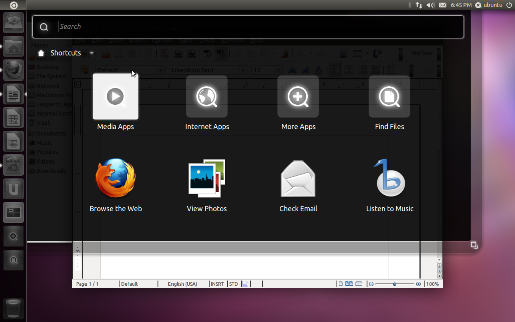
A click on the top-left Ubuntu button opens the new Unity menu. The search-by-default approach makes sense to power users, and there are a number of common tasks (‘Browse the Web’, ‘Read Email’) available, but I’m concerned this is actually less clear for less experienced users. There isn’t an easy way to see all your applications at a glance, and the icons in the search results don’t seem to be proportioned quite right to make the results easy to look at.
It’s not my favourite part of the new interface, but neither do I see it a massive problem for the type of user that I am. I quite quickly adapted to hitting the ‘logo’ key (in my case, the Command key, but for most, the Windows key!) and typing right away to search for the app that I wanted to launch. I think it might actually prove more confusing, however, for less experienced users.
Global Menu Bar
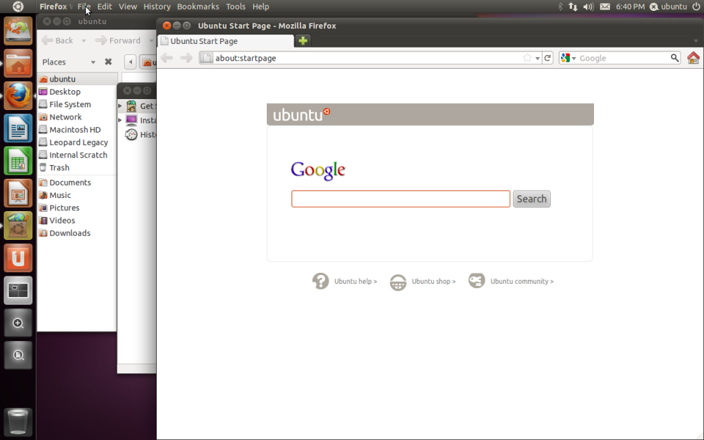
I love the Mac-style global menu bar in Unity. Instead of each application window having its own menu bar underneath the title bar, this concept has one global menu bar at the top of the screen that all applications share. The contents of the menu are context-sensitive, changing to match the active window. I love this idea on the Mac, and I love it here — it saves space on screen for menus you are unlikely to use, gives an elegant appearance and makes applications feel more integrated with the operating system.
The implementation in Unity is well implemented — it doesn’t feel at all awkward to me as a Mac user and the integration between the supported apps and the OS feels ‘right’.
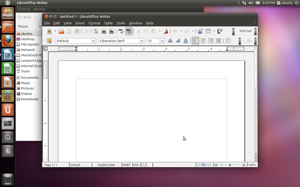
The unfortunate disadvantage to this at the moment is that not all applications are supported by the global menu bar. Particularly notable is LibreOffice, which looks compromised and clumsy (and arguably dated and out of place even on the ‘classic’ interface). I’m confident they will fix this in time, but this lack of support from such a key application suite detracts from an otherwise excellent implementation of the new menu bar.
Full-Screen Interface
The other advantage of this global menu bar concept is what you can do with full screen windows. I really dislike maximising windows — it feels wasteful of a windowing environment, especially on today’s large, high-resolution screens, and fundamentally inelegant.
The Unity interface makes full-screen beautiful.
When you maximise a window in Unity, instead of the window merely resizing to fill the screen that isn’t filled by menus and taskbars, like in other environments, the window becomes the chrome.
The window controls dock neatly next to the Ubuntu button, the title bar fills the top space (allowing the menu bar to be shown whenever the mouse hovers over that area), with the notification area to the right. It’s absolutely beautiful.
No wasted space at all — and the Launcher on the left even automatically hides to get everything extraneous out of the way. This really does feel like the way full-screen windows should have always been done — rather than merely scaling the borders of the window up to fill the screen, the borders of the window actually become the borders of the screen.
In this full-screen mode, I can’t help but feel they drew some heavy inspiration from Chromium OS and its full-screen browser GUI, but Unity is all the better for it.
Conclusion
Unity is a bold new direction for the Linux desktop, and I applaud Canonical for their courage in making changes to often very deeply-rooted conventions in their pursuit of a better desktop Linux. It’s not perfect and there is certainly room for improvement — and there will, like any interface change, be a learning curve for users.
It is a welcome, fresh design for a Linux desktop which needs to continue to evolve and develop. Unity has many elements that set it apart from other FOSS GUIs that have remained very similar for many years. I definitely look forward to seeing how they refine and perfect this interface in future releases.
Ubuntu 11.04 is out now, and I encourage you to download it and have your play yourself.
The menu bar is a huge problem for those of us who use multiple windows at the same time. Unity seems to assume two things:
1) You only use a single monitor.
2) You only use one window at a time and that window is maximized.
Unfortunately I don’t know of anyone who works this way. While I can appreciate that some, like you, enjoy these new features, it is a shame that Ubuntu has restricted their OS to only allow such a narrow set of options. 100% of the users I support have complained about the restrictions of the new desktop.
While I feel that Ubuntu has been an outstanding OS, their severely restricted desktop has caused me to begin planning migration to another OS for all of my users.
@Thor Wiegman
Thanks for your comment and for sharing your opinions on this.
One of the things that I have found about a global menu bar (both from using it on Mac OS X and in Ubuntu’s Unity interface), is that it is an extremely rare occasion when I find myself needing the menus from two different application windows visible at once. The global menu bar approach saves quite a few vertical pixels in each window that would otherwise be used to duplicate menus that I’m really unlikely to need, plus it is a simple flick up of the mouse to get to the menu bar right away.
I have to admit, Unity’s way of not revealing the menu names until you hover over the top bar (and showing only the app name until then) is less optimal than the way the Mac OS implements this feature — where all of the menus for the current app are visible at the top, all of the time. Aside from that issue with Unity, though, I personally find it more efficient, cleaner, and more pleasing.
Of course, this is just my personal opinion on what I like from my computer. Individuals all have different preferences in how they want their computers to work, as you’ve pointed out, and I don’t doubt for a moment that there are many who prefer the more traditional menu bar arrangement. For this release, you can still revert to the ‘Classic’ desktop from the login screen (although admittedly this excludes the user from all the innovations of Unity, some of which they might like).
But I think it would be a shame for the Ubuntu project to shy away from making bold, and sometimes controversial, changes to their distribution in pursuit of making the operating system, in their view, better for the future.
I’ve got ubuntu 11.10 running on a virtualbox right now. I really don’t like the interface that much. It looks nice. But I still prefer de old gnome. But sooner or later I’ll have to make a switch, then I’ll have to decide between unity and gnome3 and I’ll get used to one or the other. But I suppose both still need a lot of work. The earliest I”ll update will be 12.04 LTS. Just don’t get why they don’t just stick to good old gnome 😛
Thank you very much