I was interested to take a look at the new publicly-available developer preview of Windows 8 that was released today. I have a few (poorly organised and still unrefined) initial thoughts.
After an initial hiccup running the developer preview in VMware, I switched over to a machine with VirtualBox and got up and running. The installation process was impressively speedy, even under the virtualised conditions, and asked few questions. A good start.
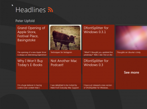
Initially, it is a little disconcerting not to have the desktop right in front of you after logging in, but I suspect that with a little retraining, the new ‘Start’ screen might prove a more convenient starting interface. The Windows Phone-style ‘tiles’ interface is genuinely innovative (praise I rarely would find myself directing at Microsoft) and seems to work in a fairly intuitive way.
I should mention at this point that my virtual machine setup and ‘traditional’ hardware combination mean that only a mouse and keyboard were available, making it impossible for me to evaluate the touch features of the OS (and making some of the ‘Metro’ apps and UI a little difficult to use). This is, of course, a limitation of my configuration, but it also raises an important point — if this new Metro UI will be the default even for computers with no touch capabilities, the whole thing needs to be smooth, optimised and not at all frustrating for this category of users too. It doesn’t feel this way yet — having to perform awkward drag gestures with a mouse isn’t a good experience at all. The viability of having a single operating system, with shared UI concepts, on very different types of computing devices is something that is yet to be proven.

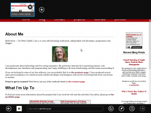
These issues aside, I find myself quite impressed at how well the combination of the new ‘Metro’ apps themselves work alongside the traditional desktop. The disparity between the two types of apps was something I thought might make the system feel clunky and ‘part-baked’, but I find myself likening it to the Mission Control view in Mac OS X Lion — the Metro apps are like your Lion apps in Full-Screen Mode, and you still have access to the traditional desktop over to the left. In short, I actually think it works.
There are certainly some minor oddities at this stage — and obviously this is far from a finished, polished product. But there is promise in this hybrid-UI design that I hadn’t expected to find. I certainly need to spend a bit more than a short hour playing with the system before I’ll really understand what I think of its potential.
The biggest challenge will be how well a single operating system will work on very different types of computing devices — and indeed whether the hardware and software on the new generation of Windows tablet devices will be up to the task.


