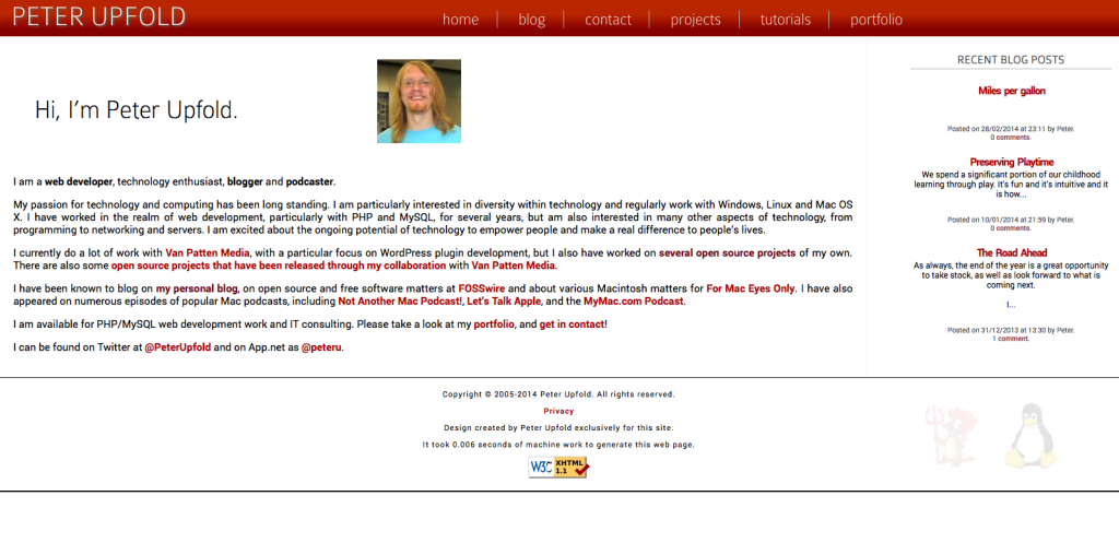
I have had a few design overhauls in my time here on this site. I haven’t, however, done anything significant to the site’s design since the beginning of 2012!
I have just finished another unrelated web design project with which I am very pleased, and, as frequently happens, it threw into sharp relief just how tired this site looked!
I am well aware that this site is also in need of a fairly generous content refresh as well — and I hope I will make some time to do that soon. For now, though, I hope the visual refresh keeps things going.
It is primarily a typographical refresh this time around. You might notice:
Who Shot the Serif, Part 2!
All serif fonts are gone!
Headings
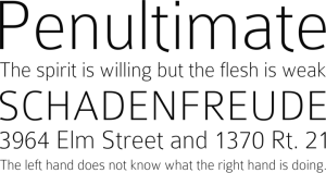
Colaborate, by Carrois Type Design, replaces Charis SIL for the header at the top of the page, and also does significant service for header text across the site.
Body Text
Colaborate’s funky looking ‘t’ character adds… well, character… but it wasn’t working for me across all the body text. Body text, then, loses its traditional Helvetica/Arial choice from before, and uses Roboto by Christian Robertson. It’s being included via Google Fonts, which should keep things nice and speedy!
There’s More… (I Hope!)
I have further ideas to tweak and refine the design, and of course, a desire to get some new content out here as well. With any luck, there will be a bit of time soon to act on those things. Watch this space.


