Skip to content

Blog

5.0

As I move closer to the significant milestone of one decade of having this personal blog, I felt that it was time for a significant overhaul of the look and feel of this site, as well as some of its non-blog post content.

Enter the 5.0 release! 🙂

Responsive and Refined…

pwdb50_fullsize

Rather than evolving the existing stylesheet and making changes, I actually started over, using a new SASS-based CSS workflow. If you look really hard, you will see bits and pieces of the old CSS hanging around that I have migrated forward for the moment. In the fullness of time, though, any of the old code should be gone!

The result is a site that is truly responsive — it is designed for small screens first, then it scales up to larger displays, rather than having a full-size only layout, but removing content for display on smaller screens. I did have a retro-fitted responsive system before, but this approach is much cleaner and delivers a more consistent result.
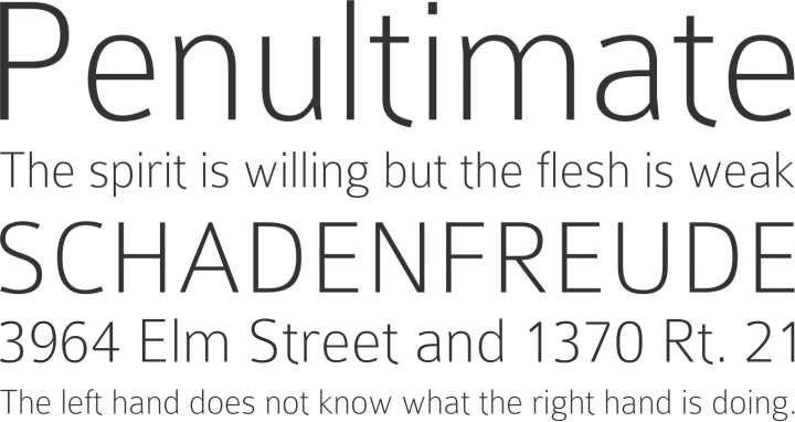
PWDB 5.0 Mobile display

A Font First!

Adding to the use of Colaborate for headings from my last design refresh, this design actually débuts my first experiment with editing fonts.

Thanks to the GPLv3 licensing terms of Colaborate, I was able to take it into TypeTool, and tone down its rather characterful lowercase ‘t’ for use as body text. The result is a custom font that, while it has its imperfections with kerning and missing ligatures, is an exciting first experiment for me — putting my interest type design to some practical use. I hope I will look back upon this first experiment with embarrassment later on when I have learned so much more, but for the moment it is very gratifying to have something to say “I did this” about!

You can download my source files for this font. This font, as it is based on Colaborate, is also licensed under the GPLv3 with font exception.

A More Modern Portfolio

The content on my Portfolio page had definitely aged, and was long overdue an overhaul. It now focuses on four main areas — Devops and Automation, Systems Administration, Web Development and Software Development.

More to Come!

As mentioned, this is a big change, but that doesn’t mean I am done! There are various other places where older content and design still might be evident, and I hope to get to more in the coming weeks.

Time for a Refresh

New site design screenshot

I have had a few design overhauls in my time here on this site. I haven’t, however, done anything significant to the site’s design since the beginning of 2012!

I have just finished another unrelated web design project with which I am very pleased, and, as frequently happens, it threw into sharp relief just how tired this site looked!

I am well aware that this site is also in need of a fairly generous content refresh as well — and I hope I will make some time to do that soon. For now, though, I hope the visual refresh keeps things going.

It is primarily a typographical refresh this time around. You might notice:

Who Shot the Serif, Part 2!

All serif fonts are gone!

Headings

Colaborate font sample

Colaborate, by Carrois Type Design, replaces Charis SIL for the header at the top of the page, and also does significant service for header text across the site.

Body Text

Roboto font sample

Colaborate’s funky looking ‘t’ character adds… well, character… but it wasn’t working for me across all the body text. Body text, then, loses its traditional Helvetica/Arial choice from before, and uses Roboto by Christian Robertson. It’s being included via Google Fonts, which should keep things nice and speedy!

There’s More… (I Hope!)

I have further ideas to tweak and refine the design, and of course, a desire to get some new content out here as well. With any luck, there will be a bit of time soon to act on those things. Watch this space.

New Year, New Site Design

A change of scenery here at my personal site has been long overdue, I think, so I’m pleased to usher in 2012 with a refresh of the site’s design!

A screenshot of the new site design

Keeping Things Compact

The first thing you’ll likely notice is the new compact, fixed header, with the navigation to the major parts of the site. It stays fixed in place, so you can always get back to any of those pages at any time. (It also swaps out the legacy image gradients for exciting new CSS3 gradients where available!)

Who Shot the Serif?

I have also moved away from Bitstream Charter/Georgia as the main font around the site, in favour of Helvetica Neue/Helvetica/Arial, combined with the existing accents of Gill Sans (where available!) for the headings. I think the site now has a more contemporary feel — and reads particularly well on devices where Helvetica Neue is available, like the iPad.

There is also a new webfont in use for the ‘Peter Upfold’ text in the header — Charis SIL (generously licensed under the SIL Open Font Licence).

Practising What I Preach

Cookie picture, by amagill -- http://www.flickr.com/photos/amagill/34754258/

As a strong proponent of users having control over their privacy online, I am pleased that the Do Not Track initiative, for indicating the user’s preferences about tracking technology on the web, has gained traction in many web browsers. Because I support the rights of users to make choices about the code running in their browsers and what information it is collecting about them, I took this opportunity to begin the implementation of Do Not Track support on my site.

» Read the rest of this post…

New Design

It’s been quite a long time since my site and blog have seen any major visual changes. I thought it was about time to give it a visual refresh, so over the past few days, I have put together this new design.

Hopefully, it retains much of the visual identity of its predecessor, while giving a welcome refresh, making things visually cleaner and making it a little less bland than previously.

I particularly like the new main navigation bar, which I think is more attractive and clearer than it used to be, while also removing the old hack I used to get the ‘button’ effect (there is no more ‘button’ effect)!

There are also a lot of changes behind the scenes to make the integration between the non-WordPress portions and the WordPress blog a lot easier.

Anyway, let me know what you think of the new design. Comments and suggestions for improvement very welcome!